08.04.2022
Horizontal and Vertical Scrolling Image Gallery with CSS Scroll Snap
Horizontal Scroll on Mobile Devices and Vertical Scroll on Desktop
The CSS property Scroll Snap allows you to end a scroll event at a fixed point. For example, images or highlighted text can snap to the exact center of the screen area when scrolling is complete.
In this process, one or more images or other content elements are packed into a „scroll container“ within which the elements then snap to specific positions after scrolling. You can find detailed explanations about the concept ofCSS Scroll Snap at Mozilla.
With CSS Scroll Snap it is therefor possible to put the essentials in the center of the screen. Without any JavaScript at all, horizontal or vertical scrolling will always scroll so far that – as in the example of the image gallery on my demo site – always moves the next image or row of images to the center or beginning or end of the surrounding container, more precisely „snapping“.
This way, lightweight sliders can also be designed, since no JavsScript is needed here. Here you can find a very nice example for such a slider.
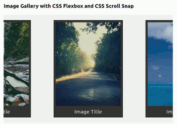
Example Image Gallery
To illustrate the principle of „scroll-snap“ I created an image gallery and designed it with CSS Flexbox. Here is the link to the demo site with the image gallery.
And here is the HTML code for the image gallery with CSS Scroll Snap:
HTML Code
<div class="gallery-scroll">
  <figure class="gallery-item">
    <img class="gallery-img" src="https://picsum.photos/230/300?random=1" alt="symbol image" title="symbol image">
    <figcaption>Image Title</figcaption>
  </figure>
  <!-- ... 20 Images at all ... -->
  <figure class="gallery-item">
    <img class="gallery-img" src="https://picsum.photos/230/300?random=20" alt="symbol image" title="symbol image">
    <figcaption>Image Title</figcaption>
  </figure>
</div><!-- end gallery-scroll -->
Notes on the HTML Code
div class="gallery-scroll": The container for the image gallery with the class gallery-scroll. Here are set the direction (y= vertical orx= horizontal) and the behavior (mandatory,proximityor both) of the scroll event.figure class="gallery-item": The element figure with the class gallery-item includes one image and one caption each. In total I have created twenty items. Here it is set at what point the scroll event should snap in:start, centerorend.img class="gallery-img": The images of the image gallery with the class gallery-img.figcaption: The caption of the image.
The Design of the Image Gallery
Horizontally and Vertically Scrollable Image Gallery
On mobile device screens, all images are arranged horizontally, so you can scroll the gallery horizontally or „swipe“ on mobile devices.
For screen sizes typical of desktop computers, the images are arranged vertically and always as many images are displayed next to each other as the screen width allows.
Horizontally Scrolling on Mobilen Devices
First I show you the CSS code for the horizontal mobile version:
CSS Code
.gallery-scroll { display: flex; flex-wrap: nowrap; margin: 0; padding: 0; background-color: #f0f0f0; scroll-snap-type: x mandatory; scroll-behavior: smooth; overflow-x: scroll; } .gallery-item { padding: .5rem; font-size: 1.2rem; text-align: center; background-color: #333; color: #d9d9d9; scroll-snap-align: center; }
Notes on the CSS Code
.gallery-scroll
display: flex: Makes the container a flex-box.flex-wrap: nowrap: Image gallery is not wrapped, images are displayed in one line.scroll-snap-type: x mandatory: Scroll direction: horizontal; scroll behavior: mandatory.scroll-behavior: smooth: Causes the scroll event to become soft or smooth; can also be set generally in the<html>element.overflow-x: scroll: A horizontal scroll bar is displayed.
.gallery-item
scroll-snap-align: center: Scroll event snaps in at the center of the elements.
Vertical Scrolling on larger Screens
When scrolling vertically, I set the height of the scroll container to 450 pixels, a little higher than the height of the images (300 pixels), so that it is always visible that more images follow.
Vertical scrolling is achieved with the following code that I put into a media query:
CSS Code
@media screen and (min-width: 800px) { .gallery-scroll { flex-wrap: wrap; padding: 1rem 0; scroll-snap-type: y mandatory; overflow-y: scroll; height: 450px; } .gallery-item { scroll-snap-align: start; } }
Notes on the CSS Code
.gallery-scroll @media screen and (min-width: 800px)
flex-wrap: wrap: Image gallery is wrapped, images are displayed one below the other and at the same time as many images are displayed side by side as the screen width allows.scroll-snap-type: y mandatory: Scroll direction: vertical; Scroll behavior: mandatory.overflow-y: scroll: A vertical scroll bar is displayed.
.gallery-item
scroll-snap-align: start: Scroll event snaps in at the top of the elements.
Here is the link to the demo site with the image gallery.
Here you can download the complete code of the demo site.
In the ZIP file you will find the HTML file and the CSS file for the image gallery with CSS Scroll Snap.
Links
You can find more explanations and examples for CSS Scroll Snap here:
Translation with the help of deepl.com