13.10.2022
Styling Paragraphs with the CSS Pseudo Elements ::first-letter and ::first-line
Making Texts Even More Attractive
It's often the "little things" that make an overall look perfect. Investing time on the design of the details of a website is not a waste of resources, but results in a harmonious overall picture – a website that people like to visit again and again. For example, part of this "detail design" is the design of the first letter of a paragraph.
The CSS pseudo element ::first-letter can be designed with some CSS properties, including all font properties, all background properties, colors, border, text-shadow and box-shadow and more (see here). Unfortunately CSS animations and CSS transitions do not work with ::first-letter.
Today I would like to present you how to style the first letter of a paragraph to achieve more attention for your texts. I will show you five examples from simple to sophisticated in terms of CSS code. These ar the following:
- First Letter Bolder
- First Letter Larger and Colored
- First Letter with Border-Radius, Box-Shadow and Background
- First Letter with Border, Border-Radius, Different Font, Text-Shadow and Styled first-line
- First Letter with Border Image
The HTML Code
The HTML Code is very simple: There are only paragraphs and in the last two examples they are wrapped in an article element. The paragraphs are given a class so that they can be designed separately.
1. Example: First Letter Bolder
Lorem ipsum dolor sit amet, consectetur adipiscing elit. Suspendisse ullamcorper, massa eu rhoncus porttitor, enim dui scelerisque augue, sed eleifend quam dolor rhoncus dolor. Nunc sit amet ornare mi, eu vestibulum lectus. Mauris ac ultricies felis.
      CSS Code
.bold::first-letter {
  margin-right: 2px;
  font-weight: bold;
}
Notes on the CSS Code
.bold::first-letter
margin-right: 2px: Creates place between the first letter and the following letters.font-weight: bold: Fattens the first letter.
2. Example: First Letter Larger and Colored
Lorem ipsum dolor sit amet, consectetur adipiscing elit. Suspendisse ullamcorper, massa eu rhoncus porttitor, enim dui scelerisque augue, sed eleifend quam dolor rhoncus dolor. Nunc sit amet ornare mi, eu vestibulum lectus. Mauris ac ultricies felis.
      CSS Code
.color-large::first-letter {
  margin-right: 2px;
  font-size: 1.5rem;
  font-weight: 700;
  color: #3636E8;
}
Notes on the CSS Code
.color-large::first-letter
margin-right: 2px: Creates place between the first letter and the following letters.font-size: 1.5rem: Makes the first letter larger.font-weight: bold: Fattens the first letter.color: #3636E8: Colors the first letter blue.
3. Example: First Letter with Border-Radius, Box-Shadow and Background
Lorem ipsum dolor sit amet, consectetur adipiscing elit. Suspendisse ullamcorper, massa eu rhoncus porttitor, enim dui scelerisque augue, sed eleifend quam dolor rhoncus dolor. Nunc sit amet ornare mi, eu vestibulum lectus. Mauris ac ultricies felis.
      CSS Code
.multi-style::first-letter {
  margin-right: 5px;
  padding: 5px;
  vertical-align: bottom;
  font-size: 3em;
  color: #115111;
  border-radius: 5px;
  background-color: rgba(14,90,14,.3);
  box-shadow: -5px 1px 5px -2px rgba(0,0,0,.75);
}
Notes on the CSS Code
.multi-style::first-letter
margin-right: 5px: Creates place between the first letter and the following letters.padding: 5px: Gives space to the first letter.vertical-align: bottom: Aligns the first line to the bottom of the first letter. Note that the bottom in this case is the bottom of the background! This may not look so nice, but it should only serve as an example here; for this the line spacing is normal.font-size: 3rem: Makes the first letter larger.background-color: rgba(14,90,14,.3): Adds a background to the first letter.box-shadow: -5px 1px 5px -2px rgba(0,0,0,.75): Adds a shadow to the background of the first letter.
4. Example: First Letter with Border, Border-Radius, Different Font, Text-Shadow and Styled first-line
Lorem ipsum dolor sit amet, consectetur adipiscing elit. Suspendisse ullamcorper, massa eu rhoncus porttitor, enim dui scelerisque augue, sed eleifend quam dolor rhoncus dolor. Nunc sit amet ornare mi, eu vestibulum lectus. Mauris ac ultricies felis.
Praesent ut orci vestibulum, tincidunt purus in, malesuada elit. Phasellus tempor dolor at accumsan suscipit. Maecenas efficitur hendrerit enim id pellentesque. Nunc placerat nibh sit amet malesuada vestibulum. Ut scelerisque sit amet velit in mattis. Mauris erat augue, eleifend nec posuere nec, vehicula vitae nibh. In hac habitasse platea dictumst.
      CSS Code
.chapter {
  background-color: snow;
}

.chapter-first-p::first-letter {
  margin: 0 5px 0 0;
  padding: 0 7px 0 0;
  vertical-align: baseline;
  font-family: 'MedievalSharp', cursive;
  font-size: 3em;
  color: #0E5A0E;
  border-color: #5DA75D;
  border-radius: 3px;
  border-style: double;
  border-width: 5px;
}

.chapter-first-p::first-line {
  font-size: 2em;
  line-height: 1.25;
  text-shadow: 2px 2px 1px rgba(14,90,14,0.6);
}
Notes on the CSS Code
.chapter
background-color: snow: Adds the background-color snow to the article element into which the text is inserted.
.chapter-first-p::first-letter
margin: 0 5px 0 0: Creates place between the first letter and the following letters.padding: 0 7px 0 0: Gives space to the first letter.vertical-align: baseline: First letter and first line are on the same level.font-family: 'MedievalSharp', cursive: The first letter is displayed in italics in the MedievalSharp font (from Google fonts).font-size: 3rem: Makes the first letter of the paragraph larger.color: #0E5A0E: Colors the first letter green.border: Styling the border of the first letter with color, radius, double line and width.
.chapter-first-p::first-line
font-size: 2rem: Makes the first line of the paragraph larger.line-height: 1.25: Gives space to the first line.text-shadow: 2px 2px 1px rgba(14,90,14,0.6): Adds a shadow to the text of the first line and the first letter.
5. Example: First Letter with Border Image
Lorem ipsum dolor sit amet, consectetur adipiscing elit. Suspendisse ullamcorper, massa eu rhoncus porttitor, enim dui scelerisque augue, sed eleifend quam dolor rhoncus dolor. Nunc sit amet ornare mi, eu vestibulum lectus. Mauris ac ultricies felis.
Praesent ut orci vestibulum, tincidunt purus in, malesuada elit. Phasellus tempor dolor at accumsan suscipit. Maecenas efficitur hendrerit enim id pellentesque. Nunc placerat nibh sit amet malesuada vestibulum. Ut scelerisque sit amet velit in mattis. Mauris erat augue, eleifend nec posuere nec, vehicula vitae nibh. In hac habitasse platea dictumst.
CSS Code
.border-image::first-letter {
margin: 0 .25rem 0 0;
padding: .5rem 1rem;
vertical-align: baseline;
background: linear-gradient(0deg, rgba(229,229,229,1) 0%, rgba(191,191,191,1) 100%);
border-style: solid; /* Chrome needs the border statements separated to display the border image */
border-color: #4d4d4d;
border-width: .000000001px;
border-image-slice: 27 27 27 27;
border-image-width: 20px 20px 20px 20px;
border-image-outset: 0px 0px 0px 0px;
border-image-repeat: stretch stretch;
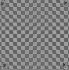
border-image-source: url("data:image/png;base64,iVBORw0KGgoAAAANSUhEUgAAAGQAAABkCAMAAABHPGVmAAAAh1BMVEUAAAAeHh4iIiIoKCgyMjI0NDQ3NzdEREROTk5PT09fX19ubm5ycnJ1dXV3d3d4eHh6enp7e3t9fX1+fn6AgICBgYGCgoKDg4OEhISFhYWHh4eJiYmKioqLi4uMjIyNjY2Pj4+QkJCRkZGSkpKUlJSXl5eYmJiZmZmcnJyfn5+goKCkpKSlpaVgxfUqAAAAAXRSTlMAQObYZgAAAAFiS0dEAIgFHUgAAAAJcEhZcwAACxMAAAsTAQCanBgAAAAHdElNRQflBQQENTfQWvfTAAABDUlEQVRoBe2ayQ6CYBCDfzdU3EBlURERFNze//lMgABOenIumtTTtP4zDd+5xvz7L81f3U8QsvvX13N83od+1KwL2fiqISyGu2SVnOojQqpOt8uB27cmg6czqywh23ea6RJk0WB0d5xDeUVIzeXO7sV1e9b0unCOVcin7DxUjbE9Luapt7GrK0KqTrfLt9xfrh/ZtnaEbN/ppq3nb9ywuSFk43MgARIgARIgARIgARIgARIgARIgARIgARIgARIgARIgARIgARIgARIgARL4YQKoEoE8xSegSgTyFBEGVSKQp8kwqBKBPE0IqkQgT5NhREOivIU8VYhBlQjkqVJQJQJ5qhCDKhHI06VwmwTePIIYTWY6LzwAAAAASUVORK5CYII=");
font-size: 3em;
font-weight: bold;
color: #4d4d4d;
}
.border-image::first-line {
line-height: 2.25;
}
Notes on the CSS Code
For this example, the PNG image is converted to base64 so that it can be used inline.
.border-image::first-letter
margin: 0 .25rem 0 0: Creates place between the first letter and the following letters.padding: .5rem 1rem: Gives space to the first letter.vertical-align: baseline: First letter and first line are on the same level.background: linear-gradient(0deg, rgba(229,229,229,1) 0%, rgba(191,191,191,1) 100%): Adds a background (gradient) to the first letter, the gradient is going from the bottom to top, starting with light grey (#e5e5e5) and ending at 100% with grey (#bfbfbf).border: Chrome needs the border statements separated to display the border image.border-width: .000000001px: Setting a minimum width is needed for displaying the background image in Chrome browser.border-image-slice: 27 27 27 27: Sets the position of the background image - in this case there are four screws.border-image-width: 20px 20px 20px 20px: Results in the same size for all four "sides" of the border image.border-image-outset: 0px 0px 0px 0px: Holds the background image in the border box (first-letter).border-image-repeat: stretch stretch: Stretching the background image into the corners of the border box (first-letter).border-image-source: url ( ... ): This is the base64 version of the png background image; so you can specify it conveniently inline.
.border-image::first-line
line-height: 2.25: Gives space to the first line.
Get the whole code on codepen.io.
I hope that I have been able to give you some inspiration on how to make your texts even more attractive with a little effort.
I wish you a lot of fun while coding your first letters and first lines.
Rüdiger Alte